
Goal
Increase retention by optimizing – redesigning the restaurant info screen.
Function: This screen has two main purposes.
1. Show information: convince people to go to a restaurant.
2. Get people to contribute: review, photos, etc.
Trying to crack the retention problem we looked at the main screen in the user flow, the restaurant info screen. It’s the screen that shows all the information about a restaurant.
At Wongnai we don’t always strictly follow a set of UX processes or run a design sprint. But we in the Growth Squad have a loose framework that goes like this.
Insight
From usability test or user interview.
Design
Trying different routes sometimes involve validating with prototype.
Measure
Post-launch monitoring. A/B Testing
Insight
From this post, I set up personas and analytics. I interviewed and ran usability tests on people that fit the persona and got some insight. I asked people what they look for when they find a place to dine. The answer varies from photos, reviews, menu, price, and location. So I used a combination of quantitative and qualitative data to base my designs on.
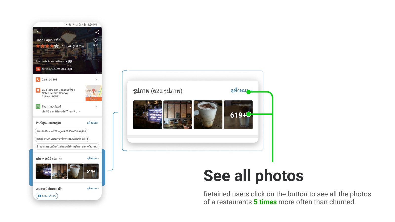
From analytics: Retained users click on the button to see all the photos of a restaurant 5 times more often than churned.

From usability test: The action bar at the bottom of the screen is confusing with the app’s main navigation. Users think they are the same so they missed out on
Design
From the insight, there are two main points for this redesign:
- Emphasize photo
- Remove bottom action bar
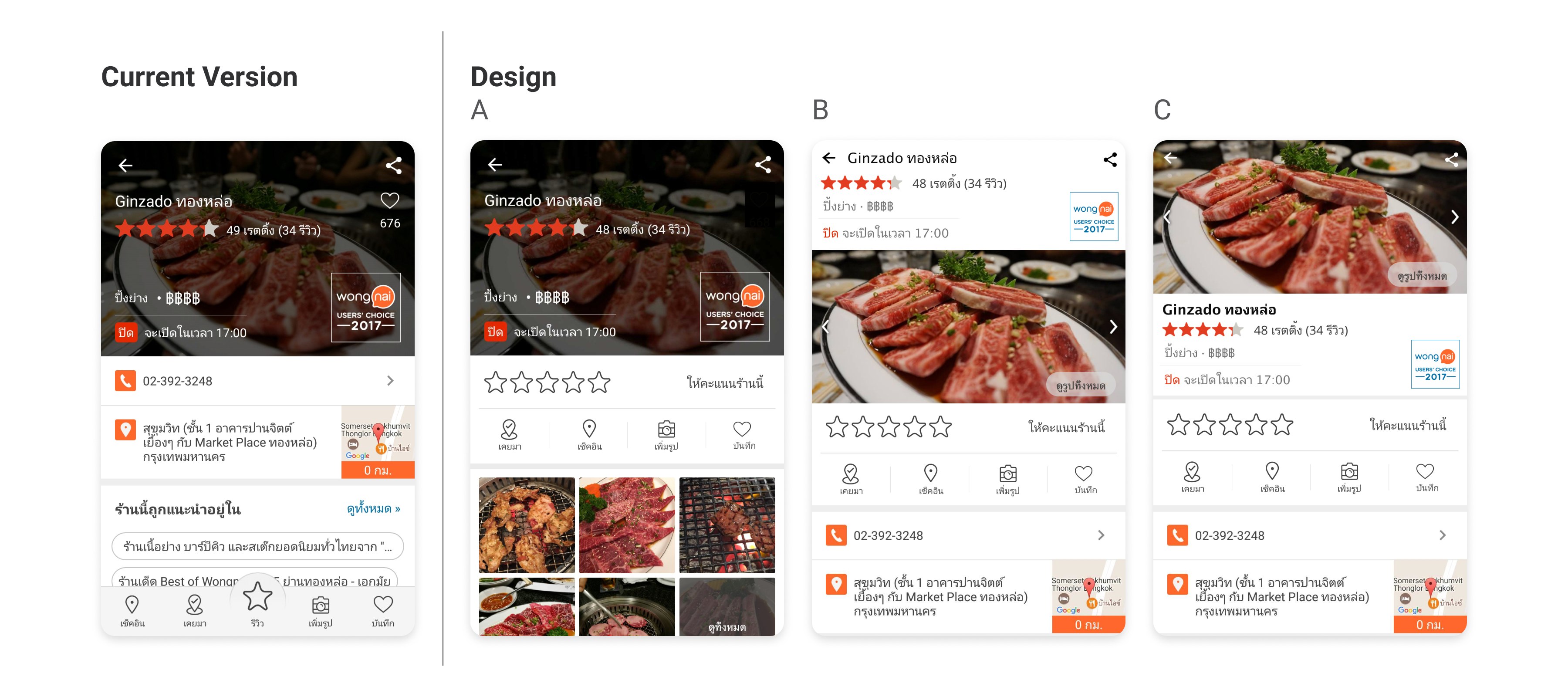
This screen has the highest views. It’s one of the most important screens. To make sure we don’t miss out on any possibility I worked on 3 main design directions with over 20 minor design variations. I skip wireframe because the decision depends a lot on the final visual and sometimes a concept may work as a wireframe but doesn’t pan out when put into real sizes.
Visually I can make a case for any of the main directions but to minimizes changes so the user doesn’t have to adjust too much, we decided to go with Design A because it has the fewest changes. (Smaller change minimize the risk)

I looked at similar apps: Zomato, Foursquare, Yelp. They have an action bar in the middle of the screen.

Following Design direction A, we went through a few more iterations. I made the cover photo smaller to give way for other content-feature. The user’s profile picture is added in an attempt to convince them to rate the restaurant. We put in a new Mini-Review flow which will be covered later. I put the traditional review button back in for users who are used to that flow.
Measure
We don’t always run A/B Testing and this time we didn’t. Theoretically, this result is inadmissible but a 10-30% increase in conversion rate pre-post launch measure gives us the confidence that the new design works better. (Some action buttons see an increase of over 100%)

Looking back measuring buttons conversion is not good enough we should look at success event - true north star (events that signify if the users found out the benefit of using in the app in our case it's when they bookmark, share or screen capture a restaurant etc).
Design: Mini Review
If you’ve noticed the old design has that gigantic review button in the middle of the bottom bar which sticks when the users scroll down. Now that’s gone in the new design we need to at least maintain the same number of reviews per week.
We made reviewing simpler. we called it Mini-Review. I designed big call-to-action rating buttons in the middle of the screen. Once the users clicked that they get hooked into writing a short review they can post instantly which contrasts with taking them to another screen to fill in the detail of a review. We made it this way to try to get the lightweight users to write a review.


Summary
To make sure there’s no negative backlash, we monitor the retention and found no decline. Without data, a case can be made for any of the design directions it would just become the personal preference. So with the result and the insights that we have to begin with we are confident that this design is an improvement for our users.